Embarking on the MDNGHT brand design journey was a deep dive into the essence of contemporary masculinity and empowerment. Our goal was to create a visual identity that resonated with the modern man’s pursuit of leadership, inner strength, and legacy.
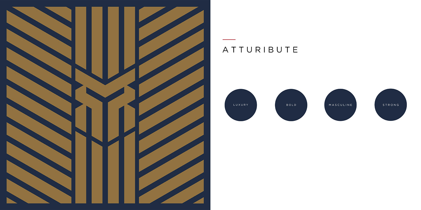
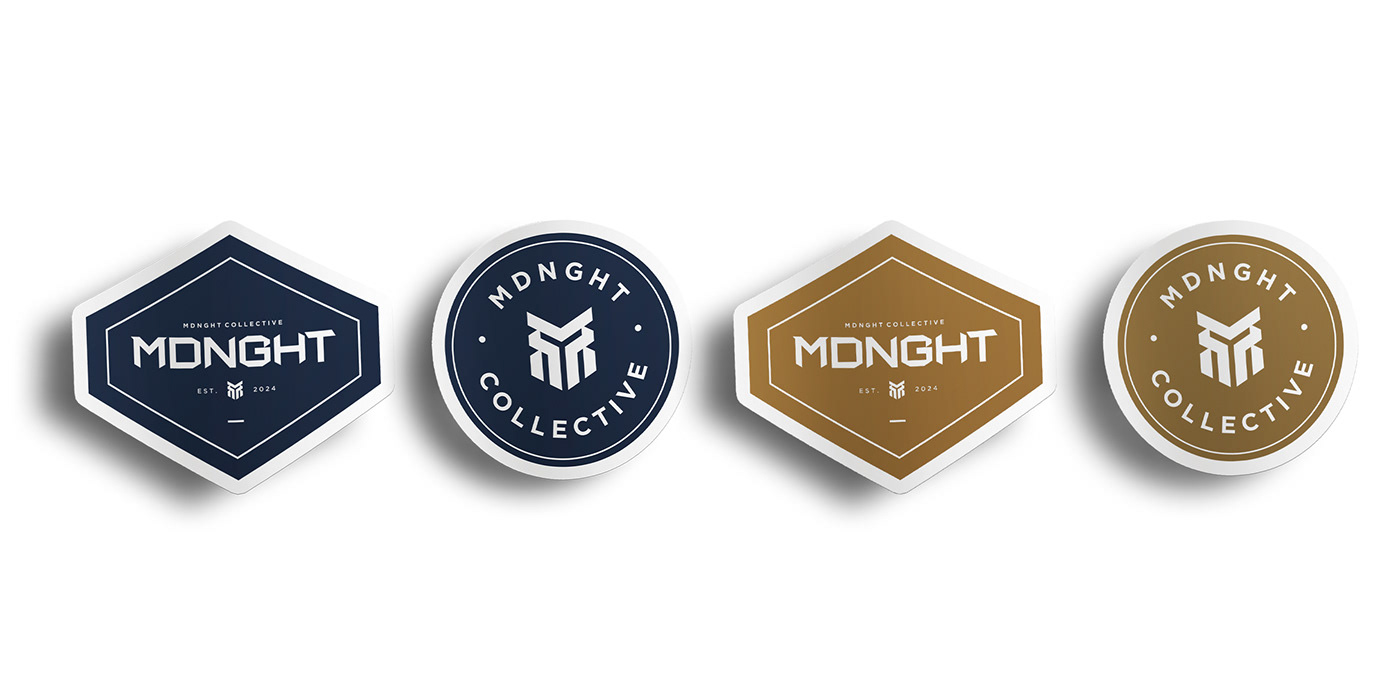
The logo, with its interlocking lines and robust form, symbolizes the interconnected paths of MDNGHT’s audience. The sharp angles reflect decisiveness, while the symmetry speaks to balance—a core value of the brand. We chose a color scheme that embodies depth and resilience (Pageant Blue and Tapenade) along with vitality and growth (Green Jacket and Barbados Cherry), ensuring that the palette speaks as loudly as the design itself.
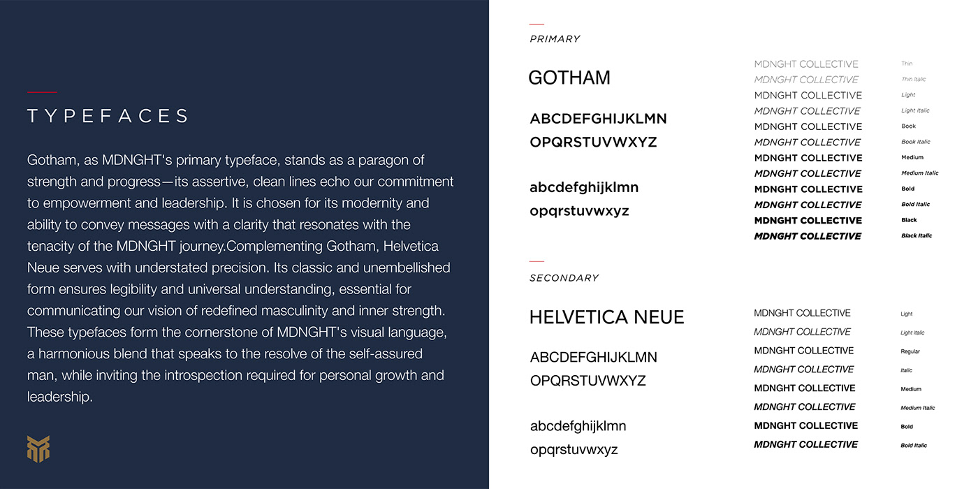
Typography was another cornerstone of our design philosophy. Gotham and Helvetica Neue were selected for their clarity and strength, paralleling the brand's voice and mission. They’re not just fonts; they’re the bearers of a message that invites every man to forge his path and claim his legacy.
With this project, we did not just design a brand; we forged an emblem for those who are on a journey to craft their odyssey and leave their mark. MDNGHT stands as a beacon for the modern man, a call to action to live boldly and with purpose. This is where design transcends aesthetics and becomes a part of a larger conversation—a narrative of growth, strength, and aspiration.
The logo, with its interlocking lines and robust form, symbolizes the interconnected paths of MDNGHT’s audience. The sharp angles reflect decisiveness, while the symmetry speaks to balance—a core value of the brand. We chose a color scheme that embodies depth and resilience (Pageant Blue and Tapenade) along with vitality and growth (Green Jacket and Barbados Cherry), ensuring that the palette speaks as loudly as the design itself.
Typography was another cornerstone of our design philosophy. Gotham and Helvetica Neue were selected for their clarity and strength, paralleling the brand's voice and mission. They’re not just fonts; they’re the bearers of a message that invites every man to forge his path and claim his legacy.
With this project, we did not just design a brand; we forged an emblem for those who are on a journey to craft their odyssey and leave their mark. MDNGHT stands as a beacon for the modern man, a call to action to live boldly and with purpose. This is where design transcends aesthetics and becomes a part of a larger conversation—a narrative of growth, strength, and aspiration.